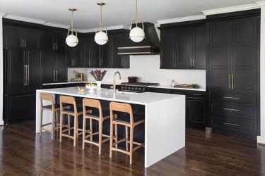
Black and white is the quintessential color pairing that packs a powerful punch. For a young St. Louis family, the contrasting colors set the design direction for their new kitchen addition. The previous kitchen in their classic Colonial home was a small, confined space. The new addition, which would include the kitchen, a breakfast area and sitting room, would be much larger and open to a family room, and it was important to the homeowners that the new spaces would feel like a continuation of their existing home.
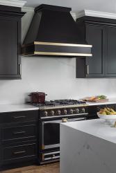
The homeowners came to their first meeting with kitchen designer Chris Paul of Alspaugh Kitchen & Bath and interior designer Lauren Sweet-Schuler armed with a design twist: they wanted black cabinets and a black La Cornue range in the new kitchen. What could be a daunting undertaking for some, Paul and Sweet-Schuler accepted the bold color palette with ease. “The new addition had expansive windows that allowed in ample natural light to balance the dark cabinetry,” Paul explains, noting that proper lighting and clean lines can help support the decision to use black and white. Paul made sure to include under-cabinet lighting and recessed can lights to illuminate the space during evening hours.
To maintain the balance of black and white, the designers sourced a white marble-inspired quartz for the countertops, full-height backsplash and waterfall edge on either side of the island. White-painted crown molding from the existing part of the home continues into the addition. To avoid a break in the crown above the black cabinets, the designers finished the wall cabinetry independently with black crown, creating a double crown molding above the cabinetry. The white crown continues throughout the room while the black crown defines the cabinetry.
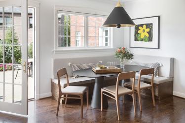
The designers incorporated neutral mid-tones to soften and warm the stark contrast of black and white. At the island, four counter stools are handcrafted from sustainably harvested Brazilian hardwood with faux leather seats for soft lines and easy maintenance for the young family. A custom banquette is built into the space to meet the family’s seating needs and is covered in a light neutral faux leather. The oak table is finished in black to complement the kitchen cabinets and is surrounded by three chairs in a similar style and finish as the island seating.
The brass details on the La Cornue range are thoughtfully repeated throughout the kitchen for a distinct look. The custom black hood is wrapped with two bands of brass, and Paul also designed the custom pantry to have brass capped feet for a furniture feel. Sweet-Schuler selected a Newport Brass faucet and Hinkley pendant lights over the island to continue the brass across the room. The breakfast area is finished off with an oversized black-and-brass pendant.
Bold and black, the kitchen is still balanced and bright for the young family, who love the functionality of the finished space and appreciate the designers’ imaginative approach to classic black and white.
Resources
Contractor: Triumph Construction
Architect: Paul Fendler
Interior Design: Lauren Sweet-Schuler
Granite: MSI Surfaces, Hallmark Stone
Plumbing Fixtures: Crescent Plumbing
Woodworking: Alspaugh Kitchen & Bath


