Sometimes it’s the slightest things—a chance encounter, an inspired purchase, hiring the right professional—that can change the direction of our lives or a project.
So it was for the homeowners of this sleek, sophisticated home. As they were planning their new house, Tom Shipp and John Callahan were browsing at Metro Lighting when a Metro representative realized the two were overwhelmed at the daunting aspect of selecting every element for a custom home. The Metro rep referred them to interior designer Julie Reinecke.
“They reached out to me before they’d even dug a hole in the ground, which always makes for the best experience,” says Reinecke, founder of Julie Reinecke Designs. “Although I’d never met them before, we just hit it off and I jumped at the chance to work with them.”
Shipp and Callahan have been together for many years, most recently living in a large, traditionally styled home in Frontenac. Sited on two acres, “it was just too big for two guys and a dog,” says Shipp. “The maintenance was crazy.” When the two began thinking of building a new, smaller home, Shipp was drawn to the aesthetic of Rocio Romero, a Chilean-American designer who gained prominence in the early 2000s for her modern, minimalist styling utilizing kit housing. Shipp and Callahan even met with Romero representatives, but ultimately scrapped the pre-fab idea.
Callahan was looking for land when he stumbled upon a steep lot within the Kirkwood city limits. The site’s "for sale" sign along a main road almost looked like it was placed as an afterthought. Heavily wooded, the lot overlooked the Meramec River in the distance. “It’s a unique lot that I think a lot of people passed over because they wondered how you could build on it,” Reinecke believes. But Shipp realized a home built on the site would deliver the privacy he craved. As the owner of a busy insurance agency, Shipp says home is “where I recharge my batteries.”
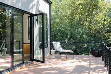
The couple engaged architect G. Clinton Borror of Eureka. “He understood the way we described the house we wanted to live in,” says Shipp, who conveyed his admiration of Romero’s design aesthetic in meetings with Borror. The result is a coolly contemporary home long on style and short on fussiness, with open concept kitchen, living and dining spaces on the main level. A dramatic, floor-to-ceiling window and accordion door system at the back of the home allows for what Shipp calls “the million-dollar views” of the Meramec River. “To them, it kind of feels like living in a treehouse, but a very sophisticated, sexy, well-thought-out treehouse,” says Reinecke.
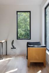
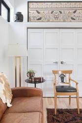
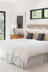
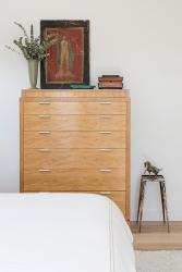
She says every detail—from the selection of the font for the house numbers to the baseboards to the placement of art—was intentional. “They wanted a high-end, eclectic aesthetic that looks well-traveled and unique,” the designer explains. Reinecke says Shipp defined his desired look as negative space, which in this case, means stylish, uncluttered, calming and purposeful. Callahan, however, is more traditionally minded. “If there’s a wall anywhere, John has to have a piece of artwork on it,” Shipp laughs. “I do have some traditional in me, but I like modern. Julie did an amazing job blending our styles.”
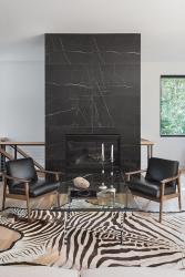
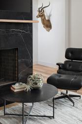
Reinecke notes the two had “wonderful, curated pieces to ‘shop’ from.” Callahan was a part-owner of an interior design center in Dallas in the 1990s; several pieces of furniture and artwork were obtained through that business. He owned a large, 19th-century Chinese silk kang (or dais) cover. It now hangs in the dining area and pairs with Shipp’s Ethan Allen dining table and chairs. Beloved treasures such as animal hides, sculptures, an Eames chair and a tortoise shell end table were a few of the pieces Reinecke suggested they use in the new home. “They had wonderful, curated pieces, so it was fun to pull out what I thought were strong pieces that would really speak to their new space,” says Reinecke. “They didn’t want a lot of ‘stuff,’ so what we selected had to stand on its own.”
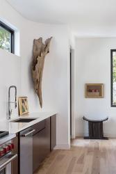
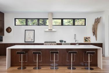
In the kitchen, Shipp wanted a minimalist aesthetic inspired by open kitchen restaurants. With no upper cabinets above the Wolf stove, the backsplash is comprised of two large pieces of white quartz, the same material used for the 14-foot-long island. A bank of windows trimmed in black, set high on the wall, allow natural light to flow in but provide privacy. A ventilation hood perfectly centered between the windows “is all you see when you look toward the kitchen from the living area, and that’s intentional,” says Shipp. The low-profile piston stools at the island don’t detract from the open aesthetic and lend a masculine touch.
A concave wall at the end of the bank of kitchen windows provided the perfect spot for a piece from Reinecke’s inventory. “I’d sourced this cypress piece on a Chicago shopping trip, not knowing where I could use it, but I had to have it because it was so unique in scale and texture,” says Reinecke. “Once I met Tom and John, I knew it would be stunning in their house. The fact it originally came from a Louisiana swamp and that Tom is from Louisiana, it was just meant to be.”
When they told her about the project, where it would be located and their desired aesthetic, “I knew it would be very unique,” says Reinecke. “They are so happy and proud of what they created, and rightly so.”
Reinecke, too, is so pleased with the finished project that she hired noted St. Louis photographer Megan Lorenz, who specializes in interiors and portraits, to take photos of the home for Reinecke’s marketing. According to Reinecke, Lorenz recognized the home’s coolly collected aesthetic and suggested it was worthy of publication. “Coming from such a well-respected photographer who shoots beautiful homes all over was a great compliment,” says Reinecke, who then contacted staff at St. Louis Homes + Lifestyles. You’re viewing the result of that conversation. The slightest things can lead to new directions…and the best results.
Resources
Architect: Gary Borror
Interior Design: Julie Reinecke Designs
Window/Door: Andersen Windows & Doors


