

Apart perhaps from the carnival funhouse, homes should avoid lopsided surfaces, slanted walls and other oddities that throw off the equilibrium of any given space. Laura Lee, owner and lead designer of Laura Lee Home, found herself nurturing the design balance of a home whose master bedroom had needed an update.
“We wanted to elevate the sophistication of the master bedroom, making it more sophisticated and a space that was ours,” recalls homeowner Susan Brown. But what started out as a simple refresh and renew project morphed into evening out the architectural features that threw off the room’s symmetry. Tending to this project became of utmost paramount.
In fact, without proper balance, a room can make inhabitants feel unwelcomed. “The bedroom was so asymmetrical that you walked in and you just wanted to leave. The bed was crammed on one side of the room. It just didn’t feel right,” explains Laura. To usher in balance, they thought to add another window. Unfortunately, their room’s window had been discontinued.
Undeterred, Laura turned to the sitting room when the husband, Roger, realized a copy of the window existed there. “It was a crime of opportunity,” she jokes. This space, however, was also asymmetrical. So, she and the homeowners had the bright idea of not only removing the window in the sitting room but allowing this new vacant space to afford an opportunity to insert additional evenness. Thus, Laura would work her magic to transform two uneven rooms into delicately balanced retreats.
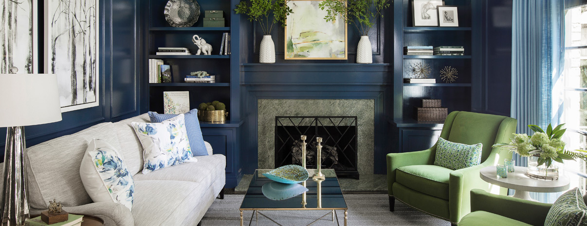
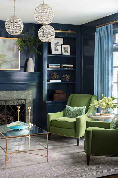
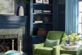
“The homeowners had the bookcases made in the sitting room so that we had two bookcases flanking the fireplace. This covered the absence of the window,” she says. The couple liked the idea of using navy blue paint and other dramatic touches. “The inspiration for the color palette—Susan has really good taste—were the fabrics used in the room.”
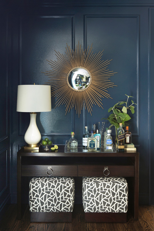
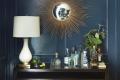
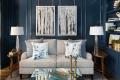
The pillows are silk fabric with shades resembling watercolors. Laura added blue drapery and modern wing chairs upholstered in green velvet to add a dash of modern charm to the space’s rather traditional tone. “We layered the lighting by adding a trio of sparkling crystal sphere light fixtures and brass picture lights over the bookcases—all on dimmers. Upholstered ottomans tuck under the console turned bar. To add dimension, we suspended black and white framed birch trees from polished nickel chains.”
Varieties of blues and greens intermingle here, while elsewhere in the house saturated oranges pair nicely with the cooler tones. The bathroom’s wallpaper is a vibrant orange with white floral details. “Orange and blue are opposites on the color wheel, so they balance each other really well.” But Laura’s quick to add that not everything in the home is perfectly even.
Laura loves mixing different hardware finishes to offer a unique look. “I really like a mix of things. We kept the couple’s existing chrome faucet in the master bathroom, for example, and then we just did a little acrylic and chrome pull. The chrome vanity was warmed up with brass and glass pendant lights and the gold-leafed mirror. When you mix things like that, it just looks like the style is more evolved and feels collected.” Sometimes, building harmony in the home means understanding when to strike a balance and when to celebrate a contrast.
Resources
Carpet/Wood/Floor: LK2
Interior Design: Laura Lee Home
Window Treatments: Fabricworks