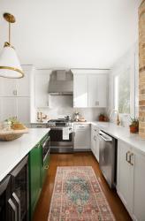
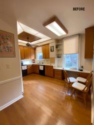
The kitchen is the heart of the home. To ensure the space stays a treasured gathering spot, kitchen designs should be elegant and timeless. Nick and Heather Burkhart loved their Century home built in the late 1800s in Webster Groves, even though the kitchen’s style had sadly waned long before they purchased the house. Wood cabinetry needed a refresh and constrained spaces wanted opening up. The couple turned to STL Property Pros to oversee the renovations and Megan Temple for her brilliant design ideas to revive the outdated kitchen, transforming the room into a white and bright showstopper.
Almost immediately, the room’s footprint was opened up by removing a wall. Open shelving was added in by a local company, Refab, which sources and repurposes materials from historic buildings in St Louis. “Nick and Heather really wanted an open concept in their kitchen because they have three kids and are pretty active. So, we took down a wall that was separating the kitchen from the living room to give them more space,” says Megan. Plus, altering the original footprint made putting in an island possible.
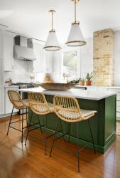
The island was at the top of the must-have list for the couple. Painted in Sherman Williams’ Isle of Pines in a semi-gloss finish, it was a dream design element, says Heather. “I felt that green was a really elegant and classic color. We didn’t want an all-white kitchen.” Yet, the kitchen’s primary cabinetry became a crisp white hue because “we wanted something that wouldn’t become dated too quickly,” she reveals. Besides, white goes with everything, and the gorgeous green of the island is enhanced rather than overpowered by the color.
“I think people forget that white cabinetry is painted in a semi-gloss finish that’s wipeable, so you will see less wear and tear with white cabinetry than others painted in a darker color,” adds Megan. Meanwhile, for the kitchen backsplash, Bedrosians tile was chosen for its natural variation in color and square shape. Giving an extra pop, the white cabinets were finished with hardware from Top Knobs in warm Honey Bronze. A lone pillar was wrapped in earthy tones and textures, warming up the kitchen still further.
Originally, both Heather and Megan were disappointed when learning the column was a necessary structural requirement. “But Megan took on the mentality that if we couldn’t remove the column, let’s highlight it. Let’s find a way to make it more of a statement piece,” says Heather. Megan had the pillar wrapped in Foundary brick by Cle’ tile to perfectly render that touch of warmth and texture. When all was said and done, the brick made the column look like something unearthed, as if the women had peeled away the wall to find the natural color hidden beneath.
In the end, the kitchen became light and bright, like the couple had wanted. The original fluorescent lighting was removed in favor of something new and fresh. Marcus Melita of STL Property Pros says the kitchen’s windows were resized to allow in more natural light, while LED pendant lights were installed above the island, offering another much-needed kitchen revitalization. “I love taking old things and giving them new life,” says Heather of her tendency to pair old and new pieces. “I like to give a warmer vibe by juxtaposing the old with the new.”
Resources
Architect: Benson Design Group
Builder: STL Property Pros
Cabinetry: ProSource
Quartz: E&B Granite
Interior Design: Megan Temple Design
Lighting: Hinkley
Plumbing Fixtures: Ferguson Bath, Kitchen & Lighting
Tile/Granite: Bedrosians Tile, Cle Tile


