The “effortlessly chic” look of a pared down space complete with clean lines, well-curated artwork and subtle yet memorable decor requires thoughtful precision and, oftentimes, a lot of hard work. Undeterred by the challenge, Jason and Lisa Noakes took up the mantel of minimalist design in their new addition to honor the history of the original 1920 house and make room for their growing boys.
“Dutch Colonials were simpler homes,” Jason says, “so we wanted to find a balance between the traditional style while embracing more modern, open spaces.” Back in 2010, the couple had purchased the residence in a neighborhood they adored but knew that if they decided to call the house their forever home, they would need to add more to it.
The major problems of the house consisted of a diminutive kitchen and a three seasons room that proved uncomfortably hot in summer, too cold in winter. Plus, they wanted the boys to have additional space: more room to play and another bedroom to give the boys, close in age, enough elbow room to spread out.
Affixing another layer of complexity, the couple wanted the addition to appear seamless with the original structure. To achieve this, they hired architect Chris Marshall of Christopher D. Marshall Architect, LLC.
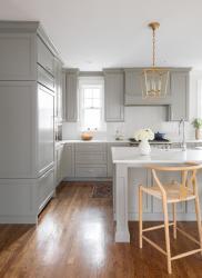
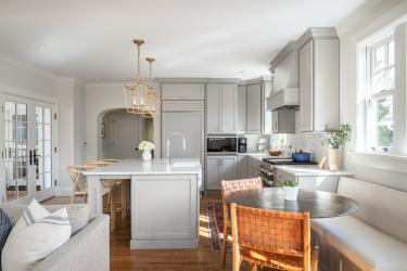
The white oak floors were selected since the color fit the home’s age better than modern washed-out hues. Contemporary appliances, like the Sub-Zero refrigerator in the kitchen, were cabinet faced and thus discreetly hidden.
But there’s a crucial difference in the faithfulness to historical accuracy. “Some of the original homes that you find here are very square, and we wanted to open that up, so we reworked the existing floor plan,” Jason says. Lisa clarifies, “But we wanted to have everything flow in a way that made sense. We didn’t want an addition that you had to enter through another room or two.”
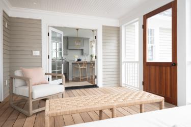
Allowing flow, French doors open from the addition’s kitchen and living room and connect with the new screened-in porch. Currents of natural light peek through the bevy of windows that Lisa says are intentionally left unadorned. The family likes the beauty that accompanies such simplicity.
“Sometimes it’s about balancing the outside with the inside,” says architect, Chris Marshall. “We used band boards and overlapping trim around the windows to make everything appear seamless, and we added these half circle windows on the back to give a special touch.”
The subsequent minimalist design of the house’s exterior accentuated the attractive architectural features already there. Inside the home, color becomes an accent. “With three boys, we wanted something with color, but we also like non-cluttered and minimal looks, even the light fixtures were picked because they are open and can be easily dusted—everything was chosen with upkeep in mind.” The kitchen island was designed around upkeep, too. The quartz, unlike softer materials like marble, would not show wear over time.
For the Noakes, minimalism and functionality go hand in hand. Open spaces, lots of light, and simple lines all perpetuate an inviting space that has a timeless aesthetic. “We wanted something we would like for fifteen years or more,” Lisa says. With their less-is-more approach, the new addition is full of luxe finishes and vibrant color to give a minimalist space maximum style.
Resources
Architect: Christopher D. Marshall Architect, LLC
Builder: D&D Magic Touch Construction
Cabinetry: Wright's Cabinet Shop
Window/Door: Webster Window & Door Co.


