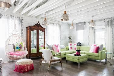
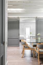
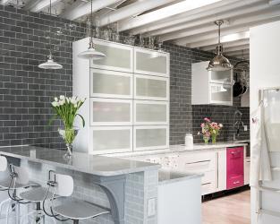
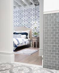
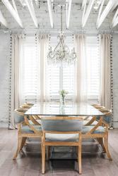
Inside her apartment on The Hill, designer Andrea Miles reinforces a timeworn saying: it’s what inside that counts. For, unbeknownst to passersby and hidden inside a mostly unadorned brick building on Shaw Avenue is Andrea’s home, a treasure trove of rich hues and stark contrasts. Inside, painted white brick walls and rafters play host to pops of colors and quirky details, from a hot pink dishwasher and a citrus green ultrasuede couch to hand-painted grey antique doors from France.
The apartment sits atop a restaurant owned by her brother-in-law, but for the longest time, the space sat vacant. A “treacherous cliff of stairs,” not up to code, made the second floor impractical in terms of any future restaurant expansion. “It never occurred to me that we would move there one day,” reveals Andrea about the apartment. “Originally my husband and I lived in a large home in Compton Heights. We have a blended family of six children, and when the last one left for college, we were basically heating and cooling floors that we didn’t even go on,” says Andrea. “So, we decided to downsize, sell the home in Compton Heights, and renovate the second floor in the building on The Hill.”
Andrea and her husband, Frank Carretero, could transform the empty rooms of the apartment into anything they chose. What Andrea wanted was loads of color, especially pink. “But my husband didn’t want the apartment to be all pink, which if I’m not reigned in, could happen,” laughs Andrea. “Frank likes a really contemporary look, so we decided to leave the ceiling and brick walls exposed. Then I decided that once the rafters were painted white, we should go ahead and paint the brick too because it was just so bright and cheery.”
The simple yet clean shade of white, along with gray hues, became the unifying factor running throughout the home. Milk white glass clads the kitchen shelves, for example, while gray microfiber chairs surround the glass dining table. Gray and white are also paired in the bathroom’s cement tiles hailing from Guadalajara, Mexico.
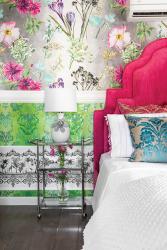
“I promised my husband that I would keep the apartment neutral with gray and white, but then I was so bored, so we made some compromises. I kept most of the walls white. But his office is a light gray. He loves blue, so we made the master bedroom in white, navy and periwinkle,” Andrea explains. “And I got to go berserk with color in the guest bedroom.”
There, her love of vibrant shades reaches new heights with the room’s five different wallpapers. The accent wall behind the bedframe sports a floral cotton wallpaper, originally meant for shower curtains from Designer's Guild, along with green damask wallpaper with metallic flakes and a gray and white cartouche wallpaper.
Yet perhaps the most unique aspect of the home, says Andrea, are the antique doors sourced from Fellenz Antiques, originally New Orleans and France painted in custom gray chalk paint and surrounded by white frames. “The doors enhance and unify the apartment. Although the colors in the other rooms may shift, our doors unify everything.”
Andrea and her husband may be a couple of empty nesters, still their apartment is full of brilliant color. “Two of the kids are still in college, but most of the time it is just him and me. With all the changes we made, I wanted to like my surroundings.”
Resources
Appliances: Big Chill
Architect: Jahneke Architects, Gates Design
Flooring: Johnson Hardwood
Glass: Preston Art Glass
Granite: United Granite
Interior Designer: Andrea Miles Design
Ironwork: Kirkwood Stair
Lighting: RH
PLumbing Fixtures: Signature Hardware
Tile: The Builder Depot
Window Treatments: Anthropologie, Overland Shades


