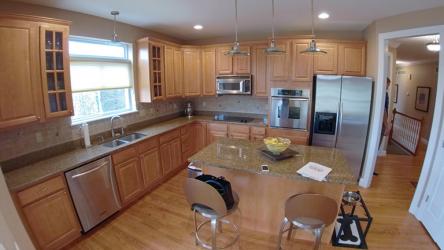
When Scott and Joan Holley left their large family home for a smaller-scale villa, they soon realized the new layout needed some tweaks to suit their new lifestyle. Recent empty-nesters, the couple were attempting to downsize but were still very involved with their church, friends and family. They wanted a comfortable home for their daily lives, but also one with the ability to accommodate large and small–scale entertaining for any occasion. But soon they noticed their spaces were too cramped. The original layout consisted of several small rooms that could flow together beautifully without walls, so they called on Roeser Home Remodeling to help them visualize a plan.
“My creative approach came from the clients’ need to make their space not only functional, but also warm and welcoming,” says Brandi Ward, Director of Design at Roeser Home Remodeling. “I try not to be influenced by my personal design taste. My goal is to gauge our clients’ specific needs, creative taste and vision for the space and make it flow into a design that reflects them. This area was very long, so I needed to flip the existing set-up in order for it to function. My team removed the original hearth room and relocated the kitchen in that space. Doing this gave way for a larger kitchen and dining area,” she sums.
Opening up the space required installing a large steel beam. Typically, Brandi likes to invert beams to get a seamless ceiling, but it was not possible with this project, so she had to get creative. She decided to have the steel beam wrapped with reclaimed barn wood. The wood tones softened the design and added warmth to the space. She also took wood beams and added them to several other areas of the house, tying the new look together as if it were part of the design all along.
“I try to envision my family and me using the space in order to relate to how my clients and their families might,” notes Brandi. “Initially, I use a mock daily routine to assess functionality. Then, I consider our clients’ family dynamic and tweak the design to create a layout that is specific to their needs. After all, they are the ones who are going to use the space every day and it needs to be a reflection of them. I really want them to own it—that’s the only way they fall in love with the design and functionality,” she adds.
The kitchen’s fresh look is a transitional design with a mix of modern clean walls and a comfortable setting. The design is incredibly open, yet areas are designated by changing cabinet colors or the placement of wood beams. These touches help showcase the structural changes that were made. The Holleys wanted white cabinets, but they were open to color for the cabinet piece that housed their dishes. The mixture of white and warm woods makes the open space seem cozy and comfortable. They also wanted the accent pieces they’ve collected from all over the world to stand out. The white walls and simple lines help make these pieces the star of the design.
“The new kitchen is a workable, functional space with easy-to-reach appliances, not to mention tons of counter space,” Joan notes. “It’s also a great gathering space. The island seats six and opens to a large dining area with a breakfront—perfect for entertaining,” she adds.
“I loved how the Holleys were willing to take risks when transforming this space,” tells Brandi. “When the walls started coming down and cabinets started coming in, they began envisioning their family there and grandchildren running around. That was a turning point for them, because it was really hard to leave their previous home and neighborhood where they raised their kids. They started to get excited about making new memories. It was a stressful time for them—moving and remodeling all at the same time,” she recalls. “But once it was all finished, Joan said it finally felt like home and they both were so appreciative.”
Resources
Contractor: Roeser Home Remodeling
Tile: R&F Tile & Marble Co.
Granite: Russo Stone & Tile Design, Inc.
Plumbing Fixtures: Premier Plumbing Studio, OJ Laughlin Plumbing Company, Inc.
Decorative Fixtures: Top Knobs
Appliances: AUTCOhome
Lighting: Wilson Lighting
Painter: Cannon Painting
Window Treatments: Befitting Fabric Studio
Glass: Kirkwood Glass
Cabinetry: Roeser Home Remodeling, Wellborn Cabinets, Inc.
Flooring: Stephen's Floor Covering
Artwork: Reclaim Renew


