Rod and Mary Ann Bryan knew they were going to love their renovated kitchen even before designer Christine Paul of Alspaugh Kitchen and Bath, St. Louis, completed the job, but there was a moment this past year, as the COVID-19 pandemic kept people at home, when they realized just how much the new design better served their needs.
“We looked at each other and said, ‘This is the greatest thing we’ve ever done, because all we are doing is cooking,’ ” Mary Ann remarks.
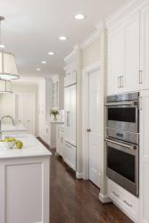
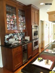
The Bryans are no strangers to kitchen renovations. They have now completed four at their 1972 home in the St. Louis suburbs—in the mid-1980s, 2000 (also designed by Alspaugh) and 2019. “We just wanted a different look,” Mary Ann says, noting their 1980s kitchen had a modern/contemporary style and the 2000 design was done in French County. Christine describes the new design as classic transitional. It features white painted cabinets and white quartz countertops, which helped achieve the Bryans’ main request—to brighten and open up the space.
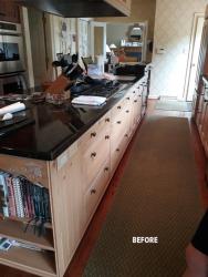
Their kitchen footprint is long and narrow, and the previous design included an island that ran the length of the room. It provided a lot of storage, Mary Ann says, but it also blocked traffic flow. The cooktop was in the island, and a bulky hood created a visual barrier to the opposite side of the room and the breakfast area.
Christine’s solution was to swap the one long island for two smaller islands, creating a more navigable space, and relocate the range top to a perimeter wall, where a custom curved white hood now creates a soft focal point. Nearly all of the appliances were relocated for the new design. The refrigerator was placed at the opening between the islands, re-imagining the work triangle as more of a “work canal” between the range and the sink. A prep sink was placed near the refrigerator to accommodate multiple cooks in separate areas. And the old drywall pantry was replaced by tall cabinets with rollout shelves providing more accessible and space-saving storage.
A few special features dress up the space. Mullion cabinets filled with sparkling glassware flank the entrance to the dining room, creating a butler’s pantry, and the quartz backsplash over the range top includes a decorative marble tile inlay. Polished nickel finishes throughout the room add sparkle. The wallcovering and fabric window treatments, both selected by interior designer Corinne Jones, provide texture and a hint of warmth to balance the starkness of the hard, white surfaces. For Mary Ann, the beauty of the kitchen is only emphasized by its function, and that makes Christine smile. Her favorite feature of the room is that it achieves what the clients asked for.
Mary Ann doesn’t have just one favorite. She loves the apron sink, the openness of the room and the flow that having two islands provides. “That function is just really great,” she says.
Resources
Contractor/Remodeler: Alspaugh Kitchen & Bath
Interior Design: Corinne Jones Interiors
Granite: DiPrimo Fabricators
Plumbing Fixtures: Premier Plumbing
Decorative Fixtures: Top Knobs
Appliances: Roth Living
Lighting: Vaughan Designs
Woodworking/Cabinetry: Alspaugh Kitchen & Bath
Flooring: Mid-West Floor


