Blending the Past with the Present
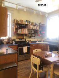
When it came time to renovate their dated kitchen, it was important to homeowners Bob and Michele to remain historically truthful to the age of their 1907 home. Remodeled in the 1980s, the kitchen had blue laminate countertops, golden oak wood cabinets and an undesirable layout with little storage or space to entertain. Bob and Michele love to host family and friends and they needed their kitchen to parallel their lifestyle.
The goal for the renovation was to make more available space without structurally changing the current kitchen adding modern conveniences while respecting the tradition and structure of the 120-year-old home. The couple was referred to kitchen designer Chelsea Smith, Chelsea Design Company, from a friend. “Her passion and energy really stood out,” the homeowner says.
Chelsea established a new layout that would function better for the homeowners, who are avid cooks. The refrigerator was originally crammed beside a large radiator and sink in a corner near the range. Open bookcases mounted to the wall provided storage for the wife’s cookbooks, dried spices and mixing bowls. A breakfast table sat in the middle of the space, and on the opposite side of the room was a set of closets and cabinetry used as a drink station.
Architectural and historical limitations presented some challenges. Two windows at the corners of the room didn’t allow for normal wall cabinetry, all electrical had to be converted and in order to add ventilation for the stove Chelsea had to use the original vent to the outside to avoid having to go through the Historical Review Board. Given the client’s goals and limitations, Chelsea suggested a galley-like layout, which would separate the prep and entertaining spaces and allowed the kitchen to take advantage of the entire room. To open up the layout, a protruding wall by the basement door was partially removed as well as one of two closets to accommodate space for a new refrigerator, custom pantry and drink station.
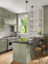
On the prep side, a 42” Thermador range was centered on the existing vent, a commercial-grade vent was installed and wall storage, stacked to the ceiling, was placed on either side. To maximize storage, drawers on both sides of the range include custom space for vertical cookie sheets and cutting boards. Smith added a custom antique brass bistro shelf, fabricated by Theiss Plating, for open, accessible storage and a space for drying herbs.
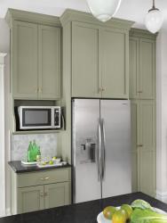
The peninsula features a large farmhouse sink, dishwasher and hidden trash and recycling. The honed black granite countertop was extended to accommodate three bar stools and an open bookcase for storing Michele’s cookbooks. The adjacent radiator cabinet stores small appliances. The drink station remained in the same location, and is the new location for the refrigerator. Smith added tall stacked cabinets to the ceiling for serving platters and bowls.
The homeowners originally requested an all white kitchen. As the layout came together Smith threw the couple a curve ball and suggested a nature-inspired, green color for the cabinetry. “To my surprise, they loved the idea,” she says. “The green still reads very neutral but introduced a little something extra. Sometimes it reads gray, sometimes olive or sage.”
The finish details drove home the historic character of the space. The plumbing fixtures, bistro shelves and cabinet hardware are all finished in antique brass. The light fixtures above the peninsula have an acorn-shaped, milk glass shade with ceiling plates that resemble leaves or flowers. “The fixtures are very Art Nouveau, which was a popular art movement during the home’s erection and a main source of inspiration,” Smith says.
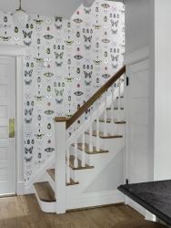
One of the final selections that pulled together the entire room is a wall of insect wallpaper, which has an old-fashioned botanical feel. “The wallpaper is a surprise and delight that brings an entire artful and outdoors feel to a kitchen we wanted to be artful and tied to the nature in which we delight in our garden and landscaping,” the homeowner says.
Looking at this charming, historic kitchen, one would never know that the entire project was completed during the COVID19 pandemic. The original kitchen was demoed one week before the stay-at-home order was issued, but despite it all Smith managed to keep the 10-week project on track. That’s not to say the project did not face complications along the way. The warehouse holding the cabinetry shut down and was no longer able to deliver the cabinets. The project’s installer, Konnor Sincox of Wise Brothers, drove a U-Haul truck and picked up the cabinets so there was no delay. Virtual and Facetime inspections kept the project going. Smith and the homeowners took extra precautions by meeting virtually when possible, wearing masks, staying distanced and regularly disinfecting.
The timeless new design honors the history of the home while functioning for the couple to cook and entertain. “Who would have thought a galley design would create so much space,” Smith says. “We went from cramped, cluttered, ugly and inefficient to spacious, functional and gorgeous,” the homeowners add. “Not beautiful, gorgeous!”
Resources
Appliances: Slyman Brothers
Builder/Remodeler: Wise Brothers Contracting, LLC
Cabinetry: Bertch Cabinets
Flooring: All Wood Flooring
Furniture: Pottery Barn
Granite Fabricator: StoneTrends
Interior Designer: Chelsea Design Company
Ironwork: Theiss Painting
Lighting: Rejuvenation
PLumbing fixtures: Cresecent Plumbing Supply Co.
Tile/Granite Supplier: The Tile Shop
Woodworking/Millwork: Wise Brothers Contracting, LLC
By Melissa Mauzy
Photography by Alise O’Brien Photography


