When the young couple who owns this home first got married, they did what most newlyweds do: combined their stuff and made do for a while. “It was kind of conglomerated together with anything we’d had in the past,” says the wife. “They kind of knew what they liked, but I don’t think they really knew what their style was,” says interior designer Maggie Jewell, who knows the couple well. “By the time they got ready to plan for this house, they were more in sync as a couple, and they knew what they wanted.”
This house is a stunner of a new build located in Glendale. Builder Monte Herring vividly recalls early meetings with the couple. “They absolutely had a vision of what they liked,” says Herring, principal of Herring Design & Development. “A very bright, light home with black windows, tall ceilings throughout and a front porch.” Herring says the couple had examples of favorite elements, which were sent to Chicago-based architect Michael Abraham. “We sent the architect some photos from Pinterest or Houzz and described what we were looking for,” says the wife. “He came back with the drawings and we just said, ‘that’s killer.’ It was everything we were looking for.”
Construction began in spring 2018. The homeowners and Jewell, who is principal of MKS Designs, went to work to realize the couple’s vision of incorporating bright pops of color onto a canvas of white walls and smooth lines. “We like aspects of Mid-century Modern, clean along with the classic,” says the wife. “We also wanted to keep it fun.”
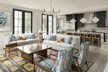
Setting the tone for fun, the family room’s reclining chairs covered in a Romo fabric helped establish the colorways used throughout the home. “It’s a cut velvet with blues, pinks, black, aqua and a little orange,” says Jewell. Neutral sofas pair with a burl wood coffee table.
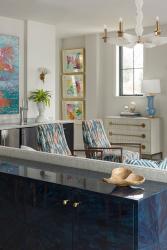
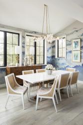
“The house is very open,” notes Jewell. “You don’t want everything to be matchy-matchy, but it all has to go together.” The light fixtures are a great example, she says. In the family room, a John-Richard white alabaster chandelier with gold tones coordinates beautifully with dynamic Jonathan Adler pendants in the adjacent kitchen. “They’re different, but they have the same sort of feeling,” Jewell says.
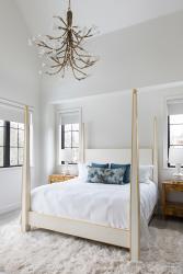
For the wife, selecting the light fixtures was one of the most fun aspects of the design process. She compares them to jewelry. “They break up the straight lines of the home and provide something to pick up your eye,” she says. “They bring so much life and a kind of levity and art to the rooms.”
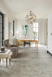
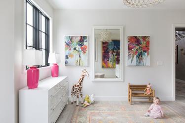
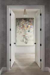
Indeed, artwork takes center stage in the home. With white walls and clean lines, “it’s almost like an art gallery feeling,” says Jewell. She helped the couple pick artwork in a mix of mediums—oils, watercolors, prints—that evoke a sense of movement and playfulness.
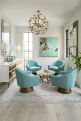
Yet, this is a family home throughout, as two little girls have now joined the family since planning began for the new home. Considering how life changes when children enter the picture, a front room of the home was originally envisioned as a playroom. Jewell suggested utilizing the space as a sitting room that would meet everyone’s needs, not just the youngest family members. The designer envisioned the parents reading to the girls or the children coloring on a round coffee table in the space, which is now as stylish as any “Mad Men” set. Turquoise chenille swivel chairs give off a Mid-century vibe, particularly when paired with an adjacent lacquer-topped cabinet housing the girls’ toys and games. “I like spaces where kids can still go in them but if adults come over in the evening, they can sit and have a glass of wine and converse with each other,” says Jewell, herself a mother of four.
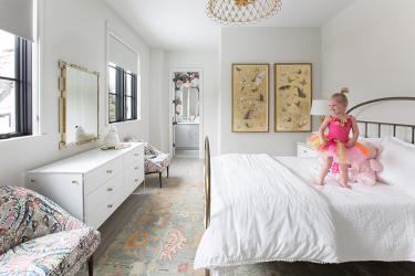
A sense of sophistication continues in the children’s bedrooms. “She didn’t want bunny rabbits and balloons,” Jewell says of the homeowner. Thinking long-term, the young mother wanted beds and dressers that could grow with the children and could also work in another home if the family ever moved, says Jewell. Case in point: the artwork in the older daughter’s bedroom. A silk screen of butterflies with gold leaf detail “is kind of playful but yet will still look great and work as she gets older,” says Jewell. The designer also utilized Mid-century Modern chairs the homeowners already owned by reupholstering them in a Schumacher cotton blend. “We even had the fabric treated so if the kids spill something on them, it will still wear like iron,” says Jewell.
The designer was at the home recently when Jewell asked the homeowner if she could believe she actually lived in such a beautiful home. “I said, yes, because you made it happen,” the homeowner laughs.
At the same time, the homeowner appreciates the craftmanship and attention to detail the entire team of architect, builder, designer, craftsmen and trades brought to the project in making the couple’s dream home a reality. At the end of the day, however, it’s not about perfection. “It’s our house now and this is where we live,” says the wife. “We recently got a puppy, and my mom said we were crazy, that the dog, who’s going to be monster size, would ruin the house. I told her I wasn’t worried about it. It’s not about the house, but what we do in it. If things get a little scratched, that’s OK. I might as well have a little fun while that’s happening.”
Resources
Appliances: AUTCOhome
Architect: Michael Abraham Architecture
Interior Designer: MKS Designs
Buildewr/Remodeler: Herring Design & Development
Granite Fabricator: E & B Granite
Plumbing Fixtures: Immerse
Tile/Granite Supplier: Global Granite & Marble
Window Treatments: KDR Designer Showrooms
Window/Door: Marvin Window & Door
Woodworking/Millwork: Herring Design & Development


