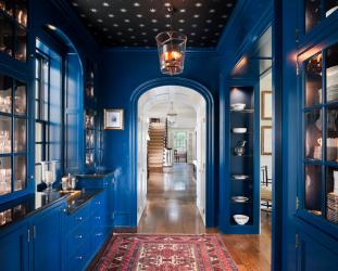
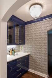
1. Bold and Blue, by Archer & Buchanan Architecture, Ltd. From the start of the project, this blue butler’s pantry was intended to be a small moment of great intensity, creating a sharp contrast to the pale palette of the balance of the house. The entire interior of the pantry was finished on site with an exceptionally smooth, highly reflective gloss enamel finish, which required a high level of skill to achieve. The ceiling is finished in a flat black paper with silver stars to exaggerate the sense of compression and shadow in this interval and transition between the formal and informal aspects of the house.
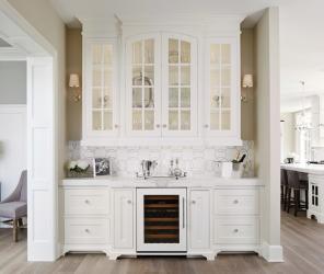
2. Classic Cabinetry, by Schwarz Lewis Design Group. This butler’s pantry is an example of a classic, medium-tone wood floor, home bar design in Chicago. The space features glass-front cabinets, white cabinets, multicolored backsplash and white countertops. There is no sink. The wall color is Smoke Embers by Benjamin Moore.
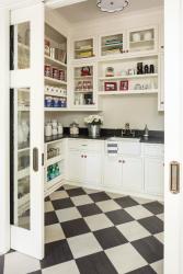
3. Black-and-White Beauty, by Martha O’Hara Interiors. This tucked away pantry and prep space is located between a mudroom and kitchen—the perfect place for dropping off groceries or making popcorn. Designer Elizabeth Darth of Martha O’Hara Interiors chose seeded glass pocket doors to allow natural light into the room and obscure messes from the outside.
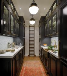
4. Gorgeous Galley, by Builder Schultz Miller, interior designer Massucco Warner Miller and architect Conard Romano Architects. This galley-style butler’s pantry, with its intricate detailing and saturated color, is accented with unlaquered brass fixtures and fittings, fulfilling our clients’ desire for a rich space set in contrast to the bright kitchen and formal dining room. Classic moldings and leaded glass cabinet doors recall elements found in the original home on the site. The hexagon backsplash tiles were custom cut from the countertop stone slab.
5. Functional and Fun, by Laura Casale Architect. We always design butlers pantry’s with a bright bold finish. It is usually where the bar is, so the space is a great place to use bold color, like the blue cabinetry in this space. We chose unique hardware and made the space a functional and fun place to store beautiful glasses and china.
1. Photography by Tom Crane Photography. 2. Photography by Werner Straube. 3. Photography by Troy Thies Photography. 4. Photography by Aaron Leitz. 5. Photography by Gretchen Murchott.


