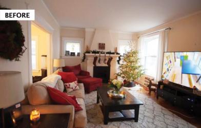
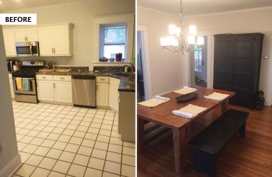
For St. Louis homeowner Cody Woods, creating an “open concept” floor plan was key for an extensive renovation of his Central West End home. The biggest challenge for gutting a home that was originally built in the early 1900s? Converting a structure that was definitely not built to be this open.
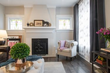
“When renovating, we really wanted to keep the charm, style and architectural designs of the era in which the house was built, but with some updates and modern touches,” says Cody. "The existing fireplace design, which resembled an old Spanish-and-California-Revival style, informed the choice for new tile installed on the hearth. We wanted the space to feel warm and inviting while still being open, so paying homage to the tradition details, like fluted trim, high baseboards and architectural accents around the windows, was a must for us.”
Three loadbearing walls were removed to provide an open-floor concept. Steel beams and columns were installed to hold up the second floor and roof loads. An additional challenge to this alteration was a large dip in the floor that had occurred many years ago due to a collapsed sewer line in the basement. To correct this, all of the flooring on the first floor was removed and the joist height raised to make the finished floor even and flat.
The project was a collaboration between the architect, cabinet maker and Ladd Suydam, owner of Ladd Suydam Contracting, who worked to define and establish the trim package, cabinetry layout and structural alterations. Cody made plumbing fixture and hardware decisions, and Ladd directed the design and trim details.
“We like to design with classic elements as much as possible to try and keep a space relative and cohesive with an old house,” says Ladd, who works alongside his business partner and wife, Jen. “We also recognize that we are living in the now, so updating that in a fresh way is important,” he adds.
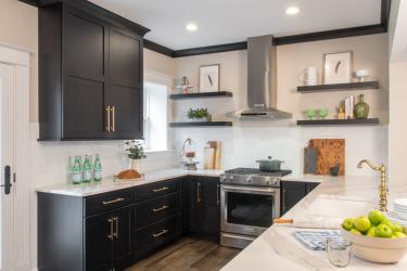
Designing a large kitchen with casual seating was Cody’s top priority, which inspired creating a long peninsula with plenty of room for casual meals and conversation. Instead of walls, he used furniture to define the space. He also loved the idea of going dark in the kitchen, with stained dark espresso custom cabinetry and antiqued brass accents that included cabinet pulls and an elegant kitchen faucet. Traditional Shaker-style cabinets and white quartz countertops that mimic the look of marble introduced a more modern vibe, and taking the cabinet color all the way to the crown molding made the cabinets seem to melt into the ceiling. Stainless steel appliances, a deep sink and a spacious butler’s pantry finished off the kitchen, and replacing a few old wooden doors with full glass doors allowed natural light to seep in and lighten up the space.
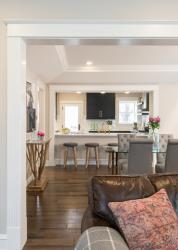
“While planning the redesign, we opted to move the back door to the side of the dining area, enlarge the kitchen, and open it up to the dining room,” says Ladd. “The dining room ceiling was trimmed out with a tray ceiling and an enlarged opening to the living room. We opened two intermediate walls to open up the sight and floor plan for a light and airy feel. You can see through and visually connect all three rooms now,” he adds.
“There is an amazing feeling you get when the project is finished, and you really start to see your vision come to life,” says Cody. “I always say the work between demo and final reveal are like birthing pains — when you’re living through it, it can be really uncomfortable, but once it’s over, you forget all about it,” he laughs.


