For Kim Sieli and her husband, Mark, renovating the kitchen was both an absolute priority and a slow-going—albeit deliberate—process. “I used to work in the emergency room, and with my patients, finding a solution was immediate,” Kim explains, “but for some reason the color choices and the palette being open just gave me…anxiety. A lot of anxiety.”
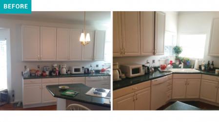
After “about seven or eight years,” Kim says with the slightest tinge of embarrassment, she made an appointment with Linda Thomas at Signature Kitchen & Bath for some outside guidance and consultation. “There was this void,” physical not existential, “they were trying to fill with some of their cabinetry and then she noticed that the cabinets had yellowed. I think that was what made her come in,” recalls Linda of their first meeting. “Well, the cabinets and the butterfly island.”
“Yeah,” Kim agrees, “the butterfly island was awkward.” Topped with a cooktop range and positioned across from an angled sink, the dysfunctional island created an even more obvious void than the cabinet issue, if you take Linda’s word for it. Though it took some time to find the solution, when they did, the entire kitchen started coming together.
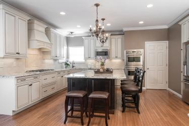
“We wanted the island to be the focus,” says Kim of the now square, granite-flanked showstopper. Black and cream with flecks of silver, the granite’s color, user-friendly shape, and beveled Ogee edge refreshed the open-concept space, making it instantly more livable.
“Though it almost drove me crazy,” Kim laughs. “Linda had to talk me off the ledge with the granite because I just couldn’t decide. I think I was the worst client.”
Linda describes it differently. “She was very thoughtful about everything she picked. A lot of clients can come in and pick everything all at once. [With Kim] it was like baby steps.” But once they got started, clearly, there was no slowing down.
As far as the cabinets were concerned, Linda explains, “I knew that rearranging wouldn’t do the trick.” The aging white Thermafoils were replaced with a set of square-cut, top-to-bottom, creamy off-white pairs with a warm chocolate glaze. To rebalance the room, they rearranged the fridge, tucked away the microwave, added can lights, and reworked the pendant lights to account for the new shape of the island. Pulling the cabinets, countertops, and island together, Linda and Kim chose Tavertine tiles for the backsplash. “You get a natural look with some pits and dimples in the stone,” Linda says. “It needs to be sealed but it isn’t shiny, kind of a matte finish. And we chose pencil and rhomboid shapes for behind the cook top.”
Located far from the surface of the island, the cooktop now sits beneath a functional hood that effortlessly blends with the shape and style of the cabinetry.
“I had been cutting out pictures from magazines for 10 years and collecting them in a school folder,” Kim says of the process. “Linda was so patient with me. She talked me through every choice.” Despite the many years of planning and preparation, the renovation came together in roughly nine months, and Kim hasn’t second guessed it once. “I love it,” Kim sighs, “but that’s probably because I took forever.”
Resources
Designer: Signature Kitchen & Bath, 636-230-6400


