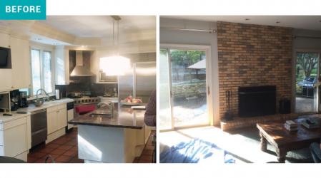
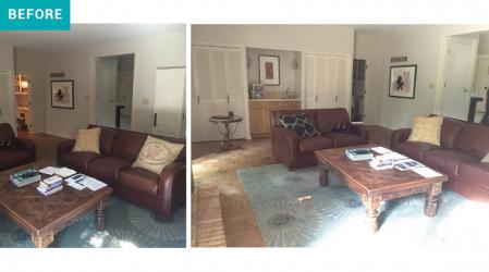
While there were plenty of doors and windows built into its original layout, this retro two-story house was always dark. When he was ready to revive his outdated kitchen, the homeowner initiated a major remodel by eliminating features that obstructed natural light: Old-school sliding patio doors – the kind with light-diffusing screens – were swapped for clear-panel French doors, and windows with between-the-glass blinds were replaced with sleeker double-hung models. The most impactful change, though, was the demolition of the wall and wet bar that partitioned off the kitchen and hearth.
“The open-floor design concept is still very stylish,” explains Shelley Satke-Niemeier, interior designer with SPACE Architects + Designers + Builders. “We aren’t in the Victorian era anymore,” she says, noting that, today, room functions overlap, and the kitchen is much more than a space for prepping meals. “It’s the center of the home,” Satke-Niemeier says.
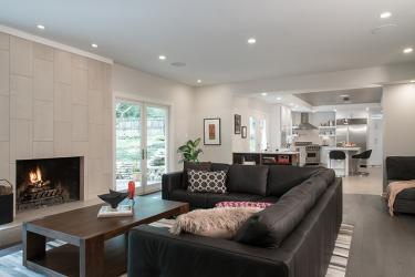
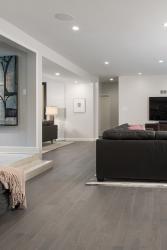
Outfitting such a pivotal room is no small undertaking. Satke-Niemeier’s secret? Start with the floor, she says. For a modern look that isn’t too slick, Satke-Niemeier began in the hearth room, opting for half-inch-thick oak wood flooring in a grey matte finish. “Typically we do a monolithic look with planks that are all one width. But here,” Satke-Niemeier says, “We used 3-, 4-, and 5-inch planks.” The result is a playful base that doesn’t take itself too seriously.
Technically, the homeowner says, the hardwood should have carried through into the kitchen. “Designers will tell you they want it all to be one color, and less is more, and so on. All of that is absolutely true,” the homeowner says. “But,” he adds, “I’m a form-follows-function guy.” Hence, he traded tired parquet for porcelain stone that won’t buckle or stain under water.
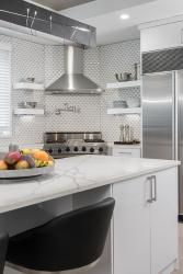
Once the floor was nailed down, the homeowner’s brick fireplace looked even more outdated than it had before. “We literally just covered it up with Crossville’s Empire tile in Cadet White,” says Satke-Niemeier, explaining, “The look is much cleaner, and it blends with the rest of the space, letting other elements speak, too.” Elements such as quartz stone countertops from Russo Stone and Tile, an Anatolia Tile + Stone beveled glazed ceramic backsplash from ISC Surfaces and Shiloh Eclipse cabinetry with clean metro-V style doors and aluminum edges, purchased from Beck/Allen Cabinetry. Up top, old-fashioned 8-inch cans were swapped for smaller and brighter eco-friendly LED recessed lighting, and the homeowner himself picked out that rugged cold-rolled steel fixture hanging above the island.
He selected a few more interiors, too, including the hearthside espresso L-shaped couch – picked for its functionality and ease of maintenance – a modern coffee table from Crate and Barrel, and a neutral horsehide rug. “There should be a reason for every design decision you make,” says Satke-Niemeier. She had fun working with this particular homeowner because, she says, he always came to the table with that mindset. “He has great taste, and he knows what he’s doing,” Satke-Niemeier adds — and it shows!
Resources
Architect, Builder/Remodeler, Interior Design: SPACE Architects + Designers + Builders, 314-534-4168
Cabinetry: Beck/Allen Cabinetry, 314-677-6713
Polarstone solid surface: Russo Stone and Tile Design, 314-771-1234
Bathroom tile, kitchen backsplash: ISC Surfaces, 314-994-7100
Flooring: Boardwalk Hardwood Floors, 314-849-0369


