When interior designer Krista Howard of KH Interiors took on the renovation of nurse Stacy Strode’s St. Louis house, it was important to accommodate entertaining, added storage and meaningful décor. It’s a tall order for any home, but Howard did it all while making Stacy’s meager 900 square feet look larger than its tiny footprint.
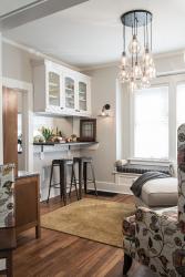
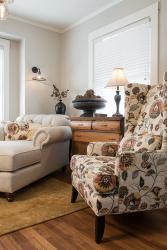
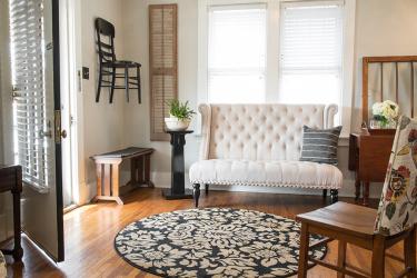
What’s immediately apparent is the illusion of size Krista created through the use of color and scale. A single color throughout draws the eye onward, as opposed to different room colors that might visually chop up the space. The soft gray reflects natural light coming into the home to provide a classic, clean and cohesive appearance with pops of color from a few patterned furnishings and decorative pieces. Caramel and black wood pieces add a crispness to the overall look.
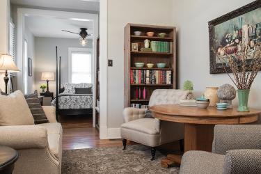
Krista used furniture to further amp up the illusion of space by scaling down the furnishings in proportion to the home. A cozy loveseat here, an upholstered living room chair there, all offering a soft place to land for guests without eating up the floorspace.
As with any small house, storage was an issue. Closets were lacking, and awkward nooks served little purpose other than to act as dead space. For Krista, the challenge was not only to put those spaces to smart use but to put certain areas of the home to multiple uses.
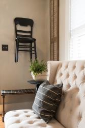
“The entry was used as perhaps a sitting room when the house was originally built in the 1916, but evolved into a dining room.” Now, the entryway serves both purposes. A round oak table occupies the entry, with a pair of chairs shifting from the foyer to elsewhere depending on how the space is being used. “One chair is hung on a wall in the bathroom as art when not in use. The other goes to the desk.”
Krista applied the same technique to the kitchen area, which Stacy envisioned as a great spot for small gatherings. “She wanted the breakfast room to be a ladies’ wine room, so we wanted kind of unconventional furniture off the kitchen so she could sit on a chaise lounge and sip wine or have friends over,” Krista says.
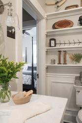
Only two closets graced the home–one in the bedroom and one in the hall–so Krista had to get creative about addressing Stacy’s need for storage. “I found a cavity in a wall that was unclaimed for any use, so we grabbed it and made it a recess for a linen closet,” she says of the cramped bathroom. “We took out the tub to create a bigger shower and used part of that space for storage.” By building in five-inch shelves on the wall behind the toilet, she created a showcase for a collection of family antiques Stacy couldn’t properly show off before.
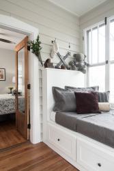
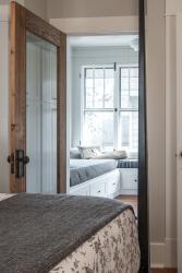
But the greatest gain in stowage by far was in the sunroom. Stacy now has attractive custom-built storage benches at the room’s perimeter and a pair of repurposed freestanding pantries providing all the storage she could want. (With a bench large enough for a twin mattress, the room can double as a bedroom where Stacy can sleep when she has overnight guests.) All told, Krista created an additional 60 square feet of storage space—and she has tips anyone can follow to get even the tiniest house organized.
“Between the studs in the walls is 14 ½ to 15 inches of great space that can be used for small-item storage,” she says. “Use under-bed storage, use baskets. Buy fewer [furniture] pieces but comfortable ones. And cut the clutter to make the space look larger. You cannot be a hoarder and be in a small space!”
Resources
Designer: Krista Howard, KH Interiors, 314-517-5502
Painting in sunroom: Pro Precision Painting, 636-278-0231
Sunroom custom cabinetry: Ev's Cabinet Shop, 636-942-3040


